Introduction:
Postcard Design- Amidst the sea of emails, social media posts, and online advertisements, traditional marketing tools often struggle to capture attention. However, one classic medium continues to stand strong and make a lasting impression – the postcard.
Postcards offer a unique and tangible way to deliver your message directly to your target audience. With their concise format and eye-catching visuals, postcards have the power to grab attention, evoke emotions, and leave a lasting impact. But for a postcard to be truly effective, it requires more than just a beautiful design; it needs to convey a clear and compelling message that resonates with its recipients.
This is where effective postcard design comes into play. It is an art that combines creativity, strategic thinking, and an understanding of human psychology. By carefully crafting the layout, selecting appropriate imagery, and using persuasive language, a well-designed postcard can engage the recipient and prompt them to take action.
Whether you are promoting a business, announcing an event, or simply reaching out to friends and family, mastering the art of postcard design will enhance your communication skills and enable you to make a lasting impact.
What should be included in a postcard design?
- A clear, bold headline
- A graphic that supports the message
- Colour that pops
- Subheads that lead into text
- Benefits, benefits, benefits
- The offer
- Your company name and logo
- Call to action.
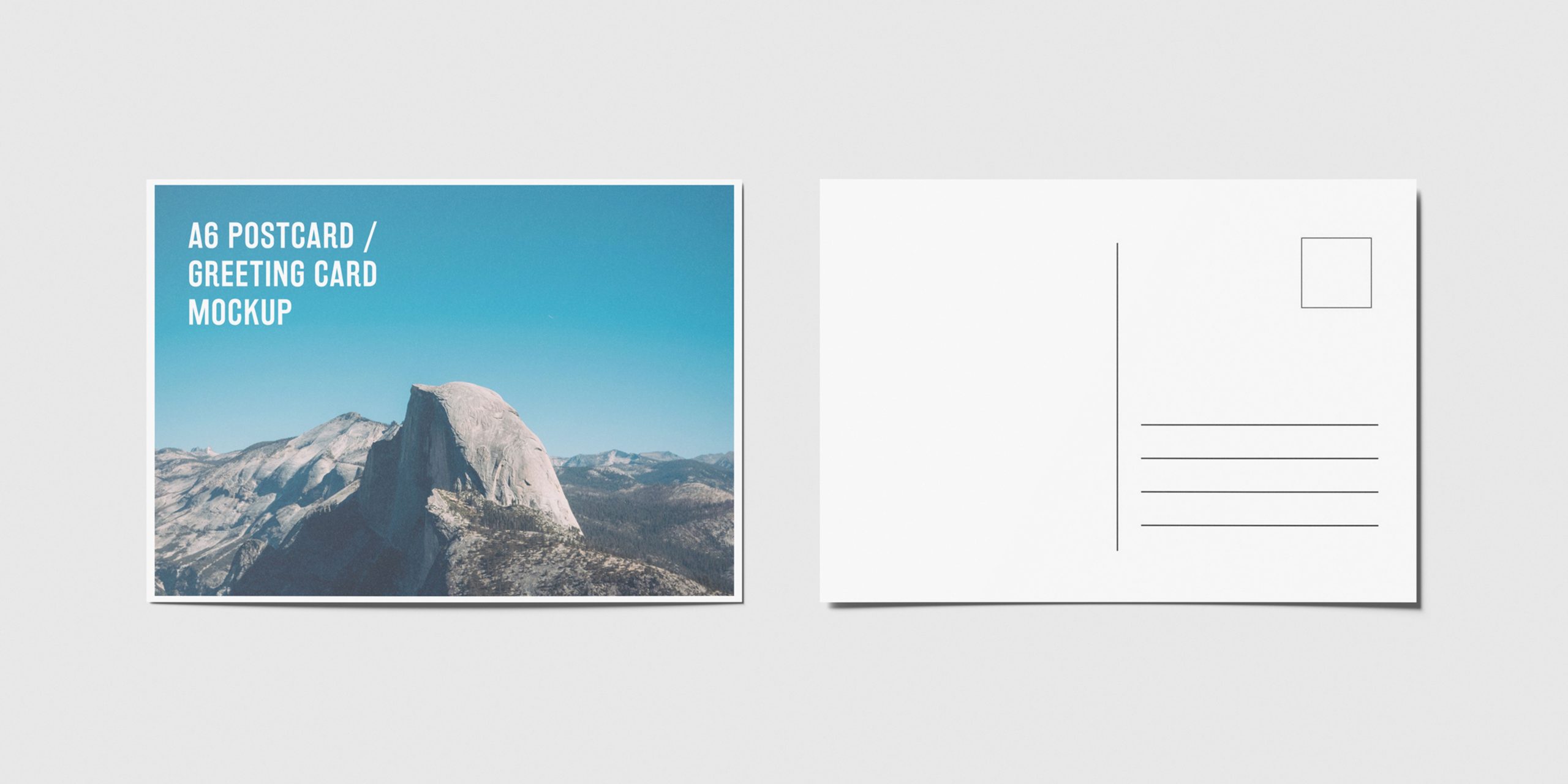
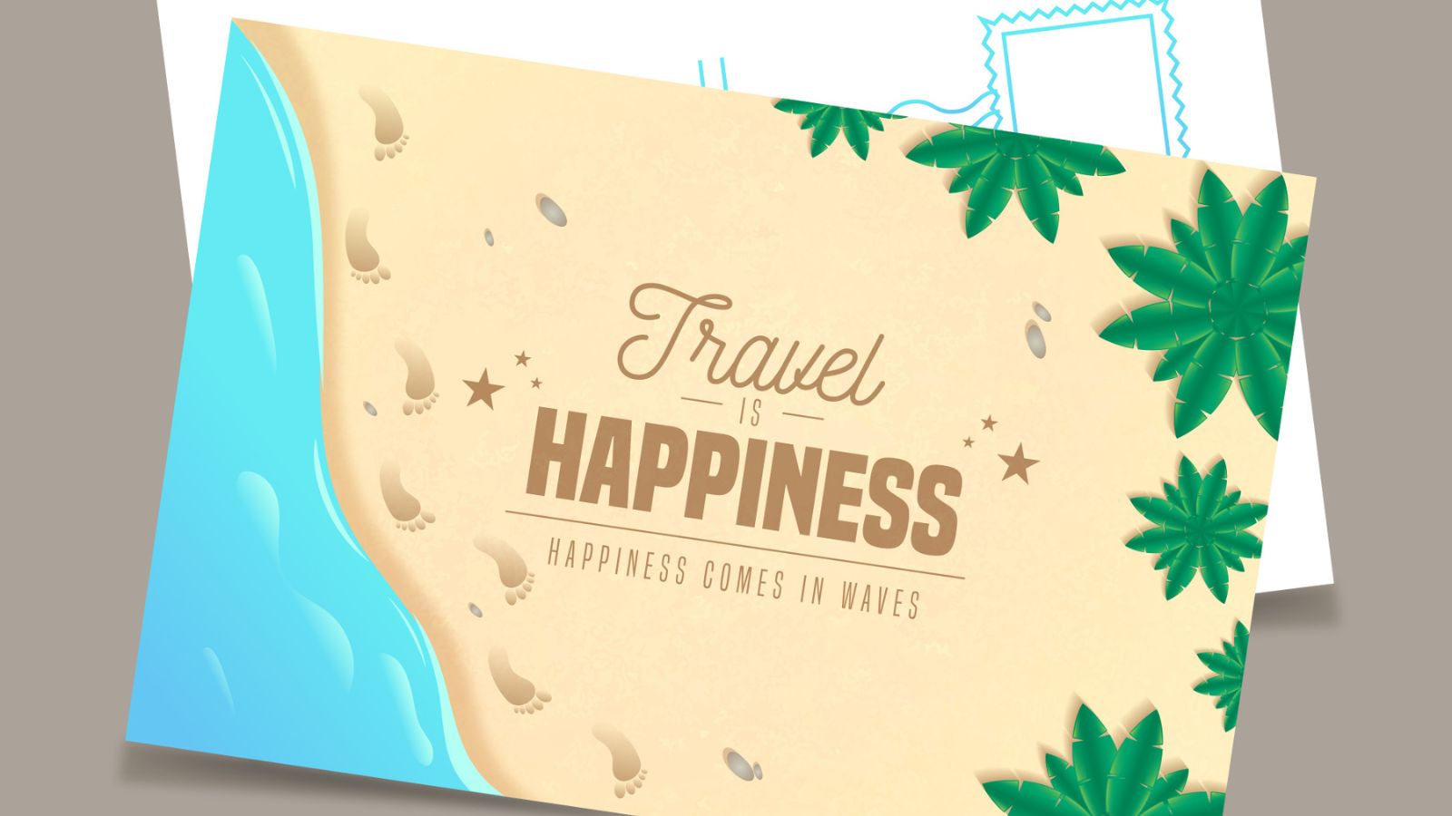
When designing a postcard, several elements should be considered to create an aesthetically pleasing and effective communication piece. Firstly, the front of the postcard should feature a captivating image that represents the intended message or the destination. Whether it’s a scenic view, a landmark, or a unique illustration, the image should immediately catch the recipient’s attention and evoke a sense of curiosity. Alongside the image, a brief and engaging headline or caption can be included to further pique the recipient’s interest.
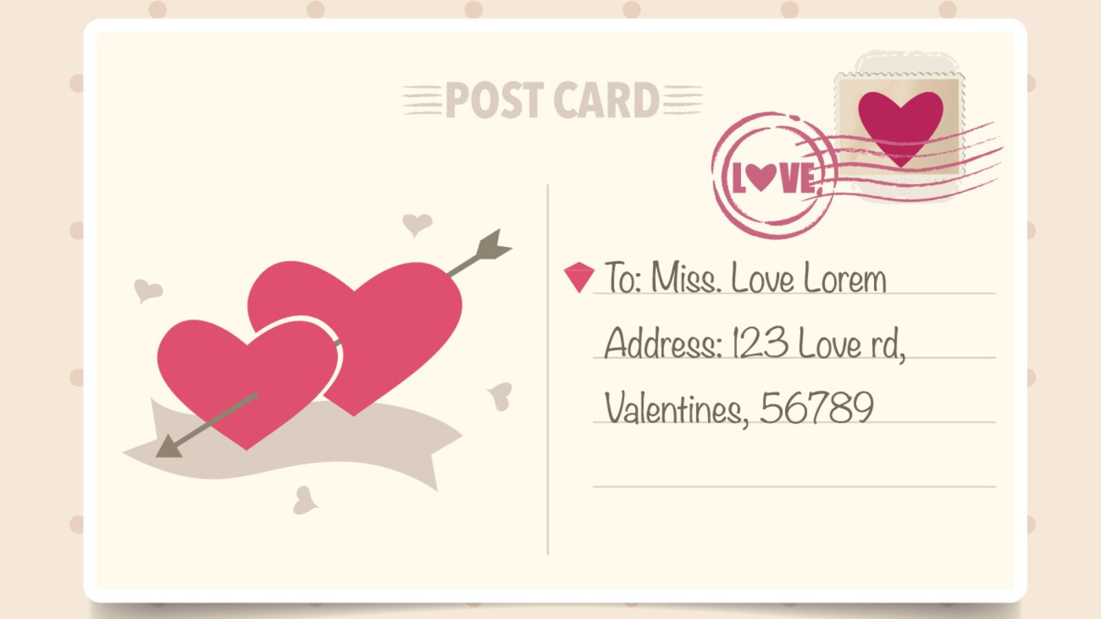
Moving to the back of the postcard, it is crucial to leave enough space for a handwritten message. A personal touch adds sincerity and warmth to the communication, making the postcard feel more special. Additionally, including lines or designated areas for the sender’s address and the recipient’s address is essential for practical reasons. These sections should be clear and easy to read. Furthermore, incorporating branding elements, such as a logo or tagline, can enhance the professional appearance of the postcard, especially when used in promotional or marketing campaigns.
Colors can evoke emotions and convey messages, while typography should be legible and complement the design. Ultimately, a well-designed postcard should be visually appealing, convey a clear message or story, allow space for personalization, and effectively represent the sender’s intentions or the destination being showcased.

How do you write a message on a postcard?
- Begin by writing your message to the recipient, which should take just the left side of the postcard
- The stamps should be stuck in the top right corner of your postcard
- The recipient’s address should be neatly written in the bottom right corner of the postcard.
When writing a message on a postcard, it’s important to keep in mind the limited space available. Here are some tips to effectively convey your thoughts and make the most of the available area. Start by greeting the recipient with a warm and personalized opening line, such as “Dear [Recipient’s Name],” or a friendly greeting like “Hello from [Your Location]!” Next, keep your message concise and focused.
Since postcards have limited space, it’s best to get straight to the point and avoid unnecessary details. Consider highlighting the key aspects of your experience or the purpose of your communication. Whether you’re sharing a travel update, expressing gratitude, or sending a quick hello, keep the message clear and to the point. If you’re describing a location or experience, try to include vivid and descriptive language to paint a picture for the recipient.
Remember to add a personal touch to the message by sharing a brief anecdote or expressing genuine emotions. Finally, end the message with a closing remark or sign-off, such as “Wishing you well,” “With love,” or a simple “Take care.” You can also consider adding a line that invites the recipient to respond or stay in touch. Don’t forget to sign your name at the end to add a personal touch.
What are the key features of a postcard?
A postcard is a card that is sent by someone on holiday telling someone all about their trip. It doesn’t need an envelope and has a picture/photograph on one side and writing on the other. It also shows the address of the person receiving the postcard.
Postcards have several key features that make them unique and effective communication tools. Firstly, postcards are compact in size, typically measuring around 4 x 6 inches or smaller. This small size allows for easy handling, mailing, and portability. Secondly, postcards have a divided back, with one side designated for the recipient’s address and postage, and the other side for the message and sender’s information. This division streamlines the process of addressing and mailing the postcard.
The visual aspect of a postcard plays a crucial role in capturing the recipient’s attention and setting the tone for the message. Another key feature of postcards is their ability to convey concise messages. Due to the limited space available, postcard messages are typically brief and focused, allowing for quick and impactful communication. Furthermore, postcards often showcase a location, whether it’s a travel destination or a local landmark. This feature adds an element of discovery and connection, making postcards popular as souvenirs or as a way to share experiences.
This aspect adds a personal and sentimental touch to the communication, making postcards memorable and cherished keepsakes. Overall, the key features of a postcard include their compact size, divided back for addressing, visual appeal, concise messaging, representation of a location, and the tangible nature of a physical object.

How can I decorate my postcard?
Draw something on the postcard! Maybe try your hand at a portrait of yourself, the postbox where you’ll post your card or perhaps match it to the image on the front – even if you’re not a great artist, it will at least make for a good laugh! Pens, tapes or glue glitter also help make a colorful statement!
When it comes to decorating your postcard, there are several creative options to make it visually appealing and engaging. Start by selecting a theme or concept that aligns with your message or purpose. Consider incorporating eye-catching imagery, such as high-quality photographs, illustrations, or graphics that effectively convey your intended message or evoke the desired emotions. You can also experiment with different artistic techniques, such as collage, watercolor, or digital illustrations, to add a unique and artistic touch to your postcard.
Color selection is crucial in postcard decoration. Choose a color palette that complements your design and helps evoke the desired mood or atmosphere. Bold and vibrant colors can grab attention, while softer tones can create a more subtle and elegant aesthetic. Ensure consistency with your branding colors to maintain brand recognition.
Typography plays a significant role in postcard decoration. Experiment with different font styles, sizes, and arrangements to create visual interest and emphasize important information. Consider the readability and legibility of the chosen fonts to ensure that your message is easily understood.
Don’t overlook the power of embellishments and decorative elements. You can add texture and dimension to your postcard by incorporating elements like ribbons, stickers, stamps, or embossed designs. These small details can enhance the overall visual appeal and create a tactile experience for the recipient.
How do you make a postcard look good?
Your postcard copy should be short and sweet. A single line or two is often enough. You can use design with text to send a clear message. Experiment with different typefaces, colors, patterns and other filters and manipulations to make your text stand out as imagery in its own right.
To make a postcard look good, there are several key considerations to keep in mind. First, focus on a visually appealing design by incorporating high-quality images, whether photographs, illustrations, or graphics, that align with your message and evoke the desired emotions. Ensure that the images are clear, well-composed, and relevant to the postcard’s purpose.
Second, pay attention to color selection. Choose a cohesive color palette that enhances the overall aesthetic and effectively communicates the desired mood or atmosphere. Consider the psychology of color and how different hues can evoke specific emotions or associations. Use colors strategically to create visual interest and highlight important elements.
Typography plays a crucial role in postcard design. Select fonts that are legible and appropriate for the tone and message of your postcard. Experiment with different font styles, sizes, and arrangements to create visual hierarchy and guide the recipient’s attention. Be consistent with font choices throughout the postcard to maintain a cohesive and professional look.
A well-organized layout is essential for a visually pleasing postcard. Utilize white space effectively to create a sense of balance and allow the design elements to breathe. Consider the placement of images, text, and other graphic elements to create a visually pleasing composition. Ensure that the layout guides the recipient’s eye smoothly from one element to another and that the most important information stands out.

What are some persuasive language techniques for postcard copywriting?
When it comes to postcard copywriting, there are several persuasive language techniques that can effectively engage the recipient and compel them to take action. Firstly, use attention-grabbing headlines or subject lines that instantly captivate the reader’s interest and make them curious to learn more. A well-crafted headline can create intrigue and entice the recipient to read further.
Secondly, employ the power of storytelling by weaving a compelling narrative or sharing a personal anecdote. Stories have a way of evoking emotions and creating a connection with the reader, making them more receptive to your message. Thirdly, leverage the use of powerful and vivid language. Choose words that paint a clear picture in the reader’s mind, evoke strong emotions, and emphasize the benefits or impact of your offer or message.
Clearly state the desired action you want the recipient to take and create a sense of urgency or exclusivity around it. For instance, using phrases like “limited time offer” or “exclusive discount” can motivate the recipient to act promptly. Lastly, personalize your message by addressing the recipient directly or using language that speaks directly to their needs, desires, or pain points.
By tailoring your copy to the individual, you can establish a stronger connection and increase the likelihood of a response. By incorporating these persuasive language techniques into your postcard copywriting, you can create compelling and engaging messages that effectively motivate the recipient to take the desired action.
How can you track the effectiveness of your postcard marketing campaigns?
Tracking the effectiveness of your postcard marketing campaigns is crucial for evaluating their impact and making informed decisions for future efforts. One way to track effectiveness is by using unique promotional codes or tracking URLs on your postcards. By assigning a specific code or URL to each postcard campaign, you can easily track the number of redemptions or clicks attributed to that campaign. This provides valuable insights into the campaign’s reach and conversion rate.
QR codes can be linked to landing pages or tracking URLs, allowing you to monitor the number of scans and subsequent actions taken by recipients. It’s also essential to integrate postcard campaigns into your overall marketing analytics. By analyzing website traffic, online conversions, or sales during the campaign period, you can assess the impact of your postcards on overall business metrics.
Ask recipients about their awareness of the campaign, their impressions, and whether they took any desired actions as a result. These insights can help fine-tune future postcard marketing strategies. By employing these tracking methods, both quantitative and qualitative, you can effectively measure the success of your postcard campaigns, identify areas for improvement, and optimise your marketing efforts for maximum impact.

What are the best practices for organizing content on a postcard?
Organizing content on a postcard requires careful consideration to ensure clarity and ease of information consumption. One of the best practices is to prioritize the most important information. Place essential details such as your key message, offer, or call-to-action prominently on the front side of the postcard. This captures the recipient’s attention immediately and encourages them to engage with the card further.
Place the most critical details at the top, followed by supporting information. This guides the recipient’s reading flow and ensures that key messages are not missed. Utilize white space effectively to create visual breathing room and separate different sections of content. This enhances readability and prevents the postcard from appearing cluttered.
This allows recipients to easily reach out or learn more about your offerings. By implementing these best practices for organizing content, you can create postcards that are visually appealing, easy to understand, and effectively deliver your message to the intended audience.
Conclusion:
Effective postcard design is a powerful tool in today’s digital age for cutting through the clutter and delivering your message with impact. By understanding the key principles and strategies discussed in this guide, you can create visually stunning postcards that captivate your audience and inspire action.
Consider the layout, imagery, color, and typography to create a visually appealing composition that grabs attention and communicates your message effectively. Craft persuasive and compelling copy that resonates with your audience, using language techniques that evoke emotions and drive action.
In a world saturated with digital advertising, postcards offer a tangible and personal way to connect with your audience. Master the art of effective postcard design, and you will unlock the potential to leave a lasting impression and achieve your marketing goals. So, go ahead and create postcards that grab attention, evoke emotions, and get your message across with precision and impact.
